
Dashboards in Cloudaware FinOps give stakeholders an at‑a‑glance view of spend, trends, and optimization signals. This guide describes standard dashboard patterns, KPIs, and example FinOps dashboards, including their key components and value for users.
Standard Dashboard Patterns
Common dashboards include:
-
Cross‑cloud cost overview
-
Total and daily cost by cloud provider, account/subscription/project, and region.
-
Top spenders (BUs, applications, customers) with drill‑down.
-
Budget vs. actual vs. forecast summaries for key scopes.
-
-
Commitment coverage & utilization
-
Reserved Instance and Savings Plan coverage and utilization by service and region.
-
Effective cost vs. on‑demand comparisons.
-
Upcoming expirations and under‑utilized commitments.
-
-
Optimization & waste
-
Rightsizing opportunities by application or account.
-
Spend on idle or underutilized resources (waste detection).
-
Savings realized and savings potential over time.
-
-
Anomalies & budget exceptions
-
Recent cost anomalies by scope and service.
-
Budgets approaching or exceeding thresholds.
-
Open investigation or remediation items linked from tickets or tasks.
-
These patterns can be combined or split depending on how you want to organize your dashboards.
Persona‑Focused Views
Different stakeholders care about different slices:
-
Executives and finance
-
High‑level trends by BU, product, and cloud provider.
-
Budget vs. forecast vs. actuals.
-
Savings realized from optimization and commitments.
-
-
FinOps and platform teams
-
Detailed breakdowns by service, account, application, and environment.
-
Allocation quality (allocated vs. unallocated spend, shared‑cost views).
-
Optimization backlogs and anomaly queues.
-
-
Engineering and application owners
-
Cost per application/environment with key drivers.
-
Unit‑cost metrics (for example, cost per user or per request where available).
-
Trends tied to releases, deployments, or scaling decisions.
-
-
MSPs and resellers
-
Customer‑by‑customer dashboards with blended vs. unblended rates.
-
Margin and discount views where applicable.
-
Use filters, dashboard folders, and role‑based access (RBAC) to target each audience appropriately.
Building Dashboards
To build a cost dashboard (at a high level):
-
Identify the questions and decisions the dashboard should support (for example, “Where is spend growing fastest?” or “How are we using RIs and SPs?“).
-
Create or reuse Salesforce Reports that answer those questions over FinOps objects (billing, allocation, optimization, anomaly, and commitment data), referencing CMDB where needed.
-
Add chart components to a dashboard using those reports, grouping and summarizing by the dimensions that matter most (provider, BU, app, environment, service).
-
Share the dashboard with the right folders and permissions, and schedule emails if stakeholders prefer inbox summaries.
Multi-Cloud Spend Dashboard
The dashboard provides a consolidated view of cloud spending across providers, products, and environments so users can monitor cost performance, understand where spend is concentrated, and identify trends that may require action. It is intended to support both executive-level cost oversight and operational analysis of the drivers behind cloud consumption.
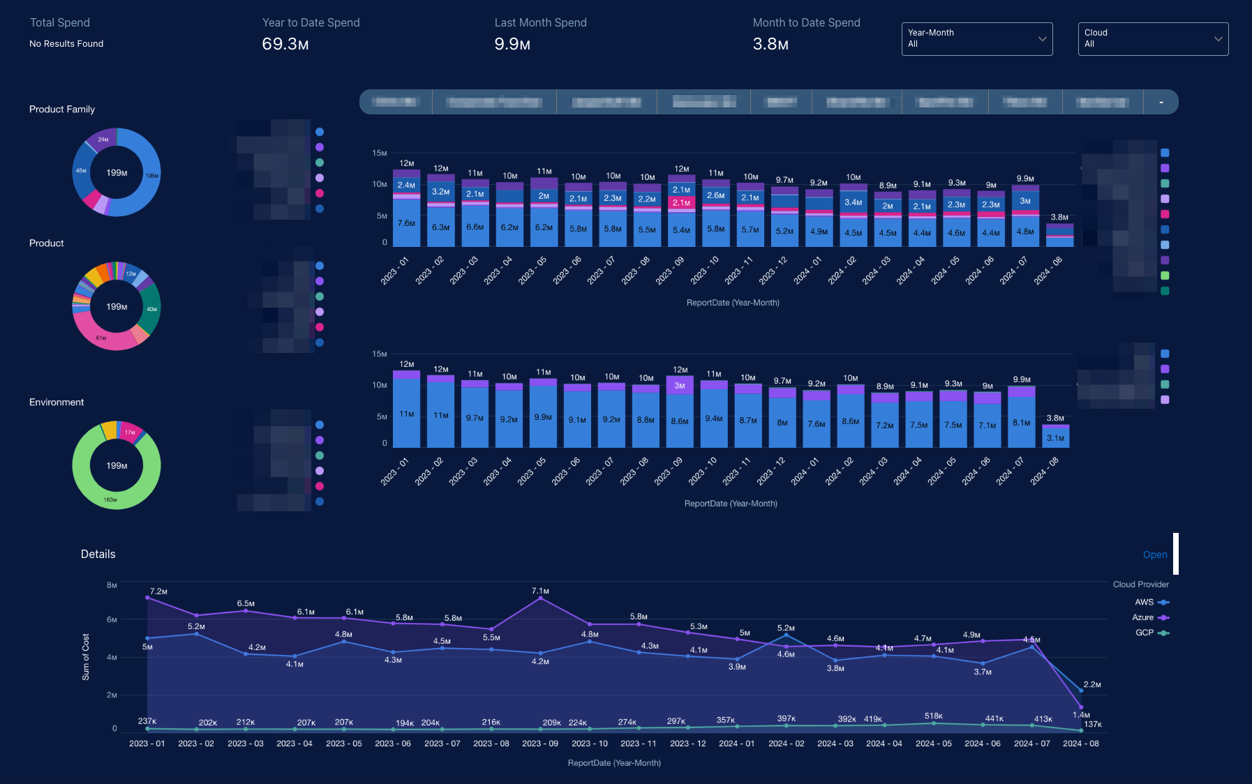
The top section presents headline spend metrics, including total spend, year-to-date spend, last month spend, and month-to-date spend. These KPIs give users an immediate understanding of current cost position and recent financial movement without needing to inspect the detailed charts first.
A filter bar allows users to refine the view by dimensions such as reporting period and cloud provider. This makes the dashboard usable for broad portfolio reviews as well as targeted analysis of a specific provider or time window.
The main visual panels show:
-
Product Family Spend Distribution: A donut chart shows how total spend is distributed across major product families. This helps users see whether cloud cost is concentrated in a few strategic platforms or spread across multiple portfolios.
-
Product Spend Distribution: A second donut chart breaks spend down further by product. This is useful for identifying the specific products or services that contribute most to the total cloud bill.
-
Environment Spend Distribution: Another donut chart shows spend by environment, such as development, test, automation, or other operational groupings. This helps users understand whether cost is aligned to production value or being driven by non-production usage.
-
Monthly Spend Trend by Category: Stacked bar charts show monthly spend over time with category-level composition. These visuals help users compare months, detect spikes or drops, and understand which categories are contributing to changes in overall spend.
-
Cloud Provider Trend Detail: A line chart shows spend by cloud provider over time, enabling users to compare provider trajectories and determine which providers are driving the largest share of cost.
For users, the value is in the following areas:
-
Centralized visibility into cloud cost. Users can see total spend and current-period metrics in one place, creating a common source of truth for financial and platform reviews.
-
Understanding of cost concentration. Breakdowns by product family, product, environment, and provider show where cloud spend is concentrated and which areas contribute most to overall cost.
-
Trend detection and anomaly identification. Monthly views make it easier to spot cost spikes, seasonal variation, sustained growth, or unexpected declines that may require investigation.
-
Provider and portfolio comparison. By comparing cloud providers and internal categories side by side, the dashboard helps users understand whether spend patterns are balanced, shifting, or overly dependent on a particular provider or portfolio area.
-
Support for optimization and accountability.The filtering and drill-down structure helps teams isolate high-cost segments, assign ownership, and prioritize cost optimization, budgeting, and governance actions.
AWS SP Coverage & Utilization Dashboard
The dashboard shows how effectively AWS EC2 Savings Plans are covering eligible usage, how fully those commitments are being utilized, and how much financial value is being realized over time. It gives users both an executive summary of commitment performance and a drill-down view into where coverage is strong, where usage remains uncovered, and whether Savings Plans are delivering the expected cost benefit.
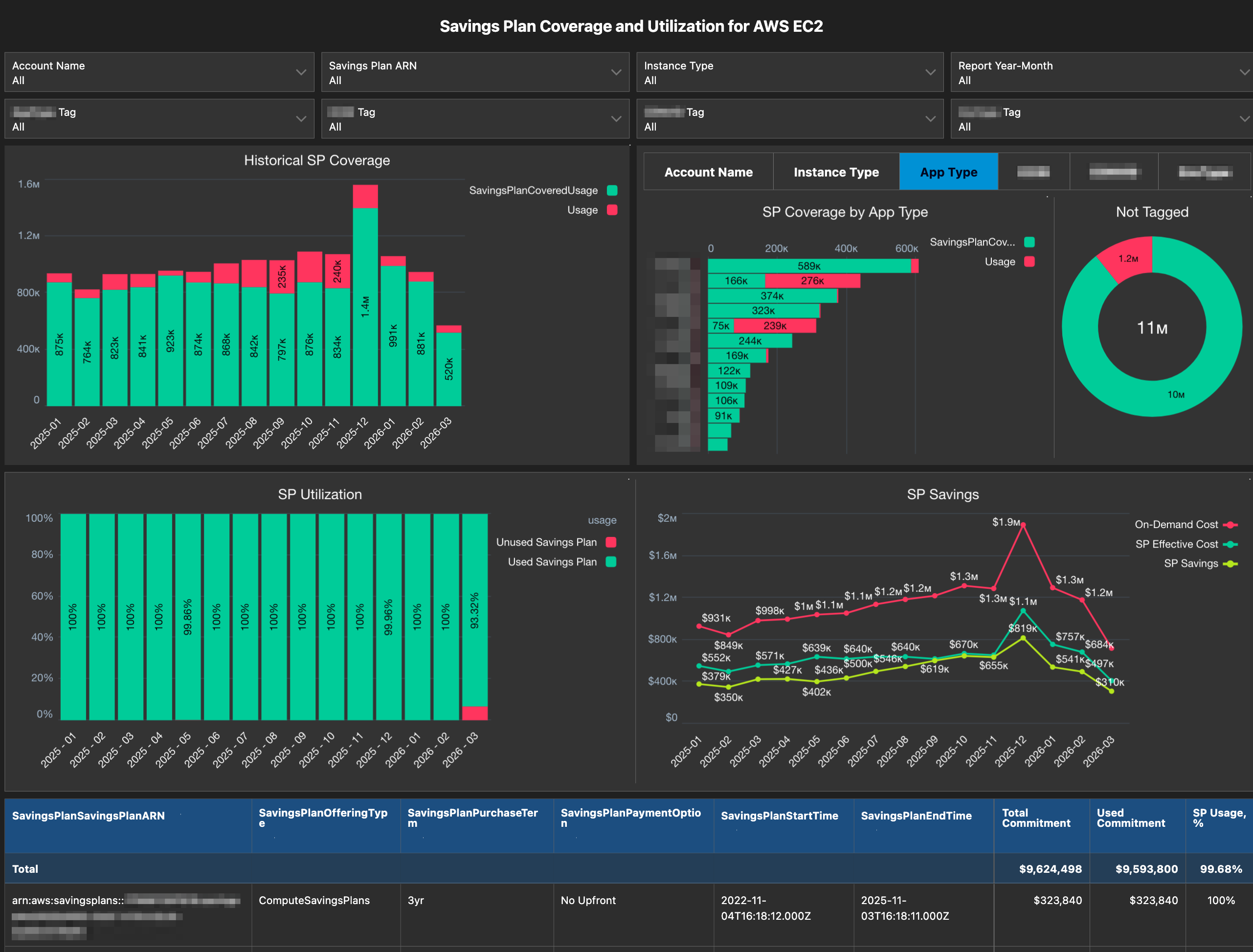
The top section is a filter bar that lets users slice the data by account name, Savings Plan ARN, instance type, report year-month, and tags such Application Type, Environment Type, and others. That makes the dashboard usable across multiple AWS accounts, business dimensions, and workload segments rather than as a single global view.
The main visual panels show:
-
Historical SP Coverage: A stacked monthly bar chart shows total eligible EC2 usage split between Savings Plan covered usage and uncovered usage. This helps users understand how much workload consumption is benefiting from Savings Plans and whether uncovered usage is increasing over time.
-
SP Coverage by Business Dimension: A tabbed breakdown lets users analyze coverage by account name, instance type, tags like
Application Type,Environment Typeand others. The ranked bar chart helps identify which workload groups are consuming the most covered usage and which groups still have a meaningful uncovered portion. -
Not Tagged: A donut chart highlights tagged versus untagged usage within the selected dimension. This helps users assess data quality for cost attribution, chargeback, and optimization analysis.
-
SP Utilization: A monthly utilization chart shows the proportion of used versus unused Savings Plan commitment. This helps users determine whether purchased commitments are being fully consumed or whether there is underutilized committed spend.
-
SP Savings: A trend chart compares on-demand cost, Savings Plan effective cost, and realized Savings Plan savings over time. This helps users quantify the financial impact of the commitment strategy and see how savings fluctuate month to month.
For users, the value is in the following areas:
-
Visibility into commitment coverage. Users can see how much EC2 usage is covered by Savings Plans versus how much is still running uncovered at on-demand rates.
-
Utilization awareness. The dashboard shows whether purchased Savings Plans are being fully used, which helps identify underutilized commitment and potential waste.
-
Savings validation. By comparing on-demand cost to effective cost and realized savings, the dashboard makes it clear whether the Savings Plan portfolio is producing the expected financial return.
-
Workload-level optimization. Breakdowns by account, instance type, app type, and other business tags help users find where additional coverage may be needed or where workload alignment with commitments can be improved.
-
Tagging and allocation quality. The tagging view highlights whether usage is properly attributed, which supports accurate reporting, ownership mapping, and downstream cost governance.
-
Support for commitment planning. Historical coverage, utilization, and savings trends help FinOps and cloud teams make better decisions on renewing, expanding, or adjusting AWS Savings Plan commitments.
Cost Anomaly Detection Dashboard
The dashboard shows short-term cost anomalies, daily spend movement, forecasted spend, and variance against expected cost patterns across accounts/subscriptions, products, and services. It gives users both an executive view of whether cloud provider spend is behaving normally and a drill-down view into which accounts/subscriptions, product areas, or services are contributing to unusual cost changes.
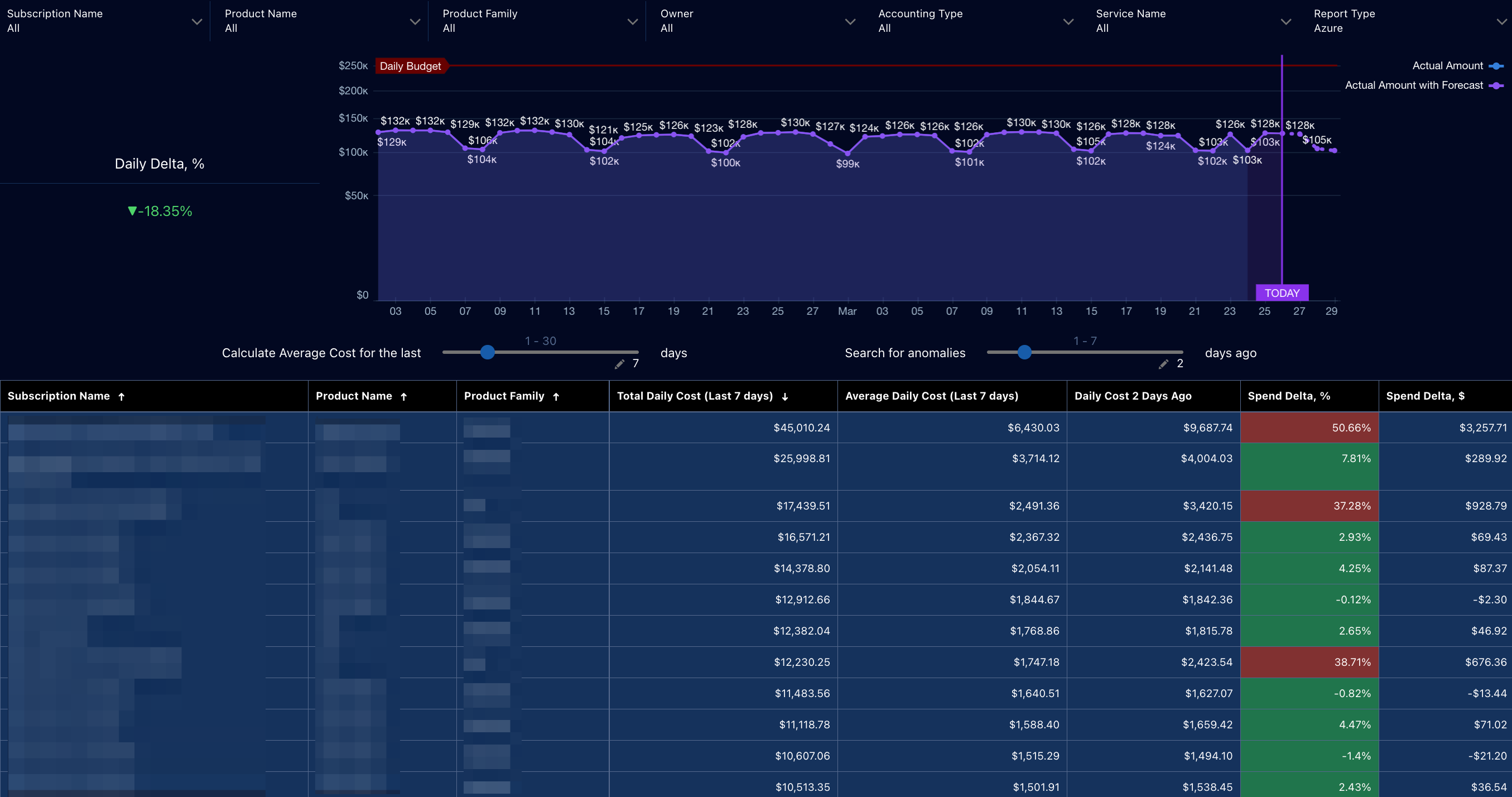
The top section is a filter bar that lets users slice the data by account/subscription name, product name, product family, owner, accounting type, service name, and report type. That makes the dashboard useful for both centralized FinOps review and targeted investigation by service owners or platform teams.
The main visual panels show:
-
Daily Delta, %: A KPI tile shows the current percentage variance in spend relative to the comparison baseline. This gives users an immediate signal that cloud provider cost is above or below expected levels.
-
Actual Amount vs. Forecast: A daily trend chart shows actual spend, forecasted spend, and a daily budget threshold. This helps users assess whether current spend is tracking normally, diverging from historical patterns, or projected to approach budget limits.
-
Anomaly Detection Controls: Adjustable controls let users define the averaging period and how many days back to compare when searching for anomalies. This makes the dashboard flexible for short-term cost investigation and tuning anomaly sensitivity.
-
Anomaly Detail Table: A ranked detail table shows account/subscription, product, and product family with recent total daily cost, average daily cost, prior-day comparison values, spend delta percentage, and spend delta dollars. This helps users isolate which cost objects are driving the anomaly.
There is also a visual marker Today, which separates historical actuals from forecasted spend and helps users interpret whether a detected issue is already occurring or is projected to emerge.
For users, the value is in the following areas:
-
Early detection of cost anomalies. Users can quickly identify unusual spend behavior before it turns into a larger month-end variance.
-
Faster root-cause investigation. The dashboard highlights which accounts/subscriptions, products, or services are contributing to unexpected cost changes, reducing time to triage.
-
Forecast-informed monitoring. By combining actuals with forecast, users can assess not only what has happened, but what is likely to happen next if the current pattern continues.
-
Budget and variance awareness. The budget line and delta metrics help users understand whether the anomaly is material from a financial control perspective.
-
Targeted ownership and action. Filters by owner, service, subscription, and product dimensions let teams narrow the issue to the relevant operational area and assign follow-up effectively.