Dashboards
Cloudaware analytics dashboards provide always‑on visibility into vulnerability exposure, coverage, and remediation progress.
Use this guide to review key dashboard use cases, recommended widgets, and example dashboards for Vulnerability Management in Cloudaware.
Use Cases
Executive Overview
- Audience: CISOs, security leadership, senior IT leaders.
- Key widgets:
- Total open vulnerabilities by risk band (Critical/High/Medium/Low).
- Trend of open vs remediated vulnerabilities over time.
- Top OUs or applications by outstanding risk.
- SLA compliance by risk band and environment.
- Purpose:
- Show whether overall risk is trending up or down.
- Highlight which parts of the organization need help.
Coverage & Hygiene
- Audience: SecOps, platform teams.
- Key widgets:
- Assets with no scan in the last N days.
- Assets with stale findings (e.g., old scan dates).
- Scan frequency by asset type or source (VSaaS vs cloud‑native vs third‑party).
- Purpose:
- Identify gaps in scanner deployment or configuration.
- Ensure that critical systems are regularly assessed.
Remediation Performance
- Audience: Application and platform owners, SecOps.
- Key widgets:
- Mean/median time to remediate (MTTR) by risk band.
- Number of vulnerabilities past SLA by OU or application.
- Remediation Tasks by status (New, In Progress, Waiting on Change, Resolved, Verified).
- Top recurring CVEs or misconfigurations.
- Purpose:
- Track how quickly teams are closing issues.
- Identify systemic problems (e.g., recurring patch failures).
Exceptions & Governance
- Audience: Risk, compliance, security leadership.
- Key widgets:
- Active exceptions by OU, application, and risk band.
- Expiring exceptions in the next 30/60/90 days.
- Total risk “under exception” compared with unsuppressed backlog.
- Purpose:
- Ensure that exceptions are temporary and justified.
- Plan review cycles with OUs and app owners.
Build Dashboards in Cloudaware
Implementation tips:
- Base components on the normalized data model (Vulnerability Scan records, Remediation Tasks, Exceptions).
- Use filters for environment, OU, application, and source.
- Provide drill‑down paths from high‑level tiles into detailed list views.
Here are examples of dashboards that Cloudaware provides on request:
Vulnerability Scans with SLAs Dashboard
The dashboard shows the overall security exposure, scan coverage, remediation posture, and historical vulnerability trends across the server estate. It gives users both an executive summary of current risk and a drill-down view into where vulnerabilities exist, how long they have been open, and whether remediation is keeping pace with policy expectations.
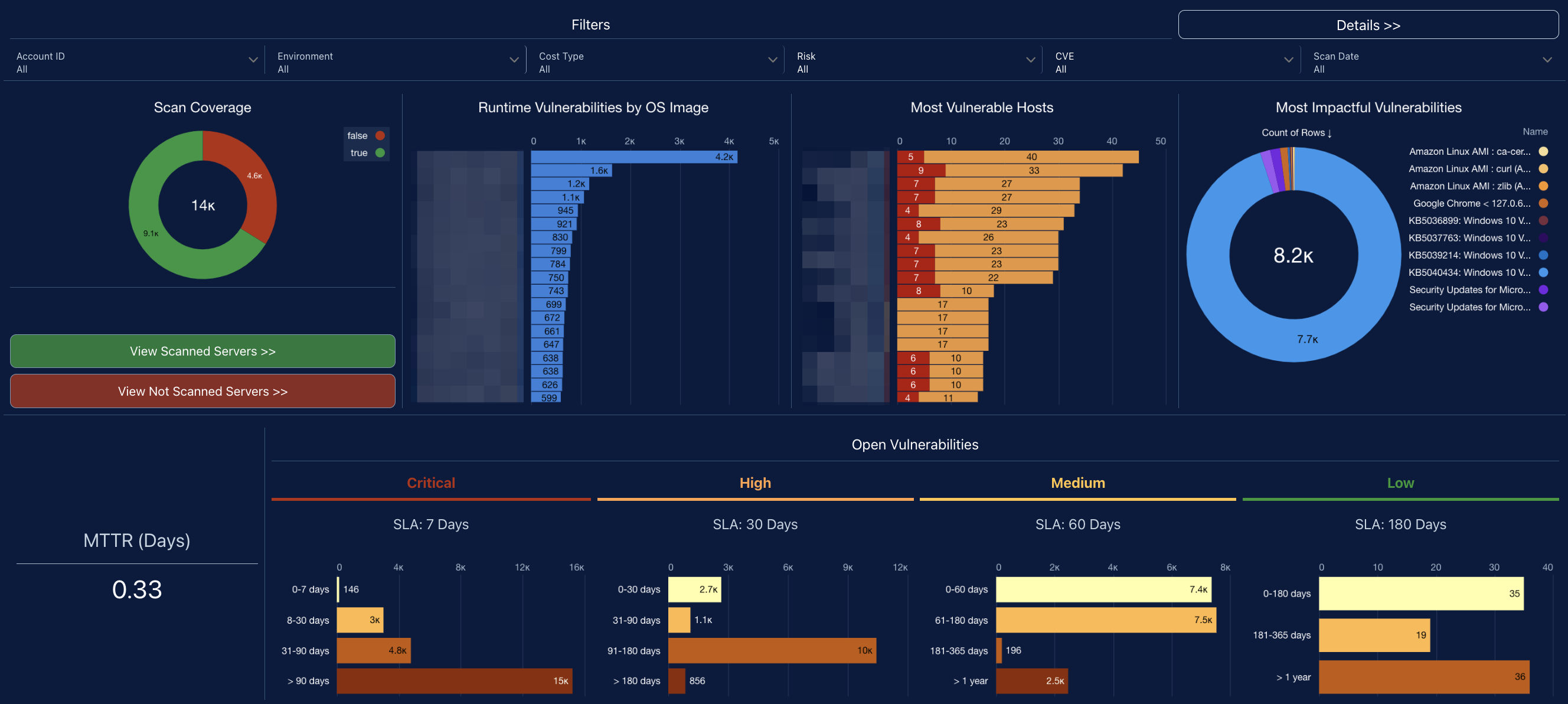
The top section is a filter bar that lets users slice the data by cloud account, asset type, risk, remediation validation status, CVE, product, environment, owner, geography, and datacenter. That makes the dashboard usable across multiple teams and infrastructure segments rather than as a single global view.
The main visual panels show:
- Active Scan Coverage on Servers: A donut chart shows how many servers are being scanned versus not scanned.
- Runtime Vulnerabilities by Image: A ranked bar chart shows which server or container images carry the most runtime vulnerabilities. This helps identify whether risk is concentrated in a few golden images or broadly distributed.
- Critical and High Risk Hosts: A host-level chart ranks servers with the highest concentration of critical/high findings. This makes it easy to prioritize the worst individual assets.
- Most Impactful Vulnerabilities: Another donut chart aggregates vulnerability families or signatures and shows which ones contribute most to overall exposure. That shows which vulnerability types are driving the backlog.
The bottom section is the SLA framing for remediation:
- Critical — SLA: 30 days
- High — SLA: 60 days
- Medium — SLA: 90 days
- Low — SLA: 180 days
There are also action buttons to view:
- Actively scanned servers
- Not scanned servers
- Remediation initiatives and tasks
For users, the value is in the following areas:
- Visibility into vulnerability exposure. Users can see the volume of open vulnerabilities, where they are concentrated, and which vulnerability types are driving the most risk.
- Scan coverage awareness. The dashboard shows how much of the server estate is actively scanned versus not scanned, which helps users understand security blind spots and coverage gaps.
- Risk-based prioritization. By highlighting the most vulnerable images and the hosts with the highest concentration of critical and high findings, the dashboard helps teams focus remediation where it will reduce risk fastest.
- SLA tracking and accountability. The severity-based SLA bands make it clear what needs to be remediated first and within what timeframe, supporting operational discipline and audit readiness.
- Targeted investigation and action. Filters by account, owner, environment, product, region, and datacenter let users isolate problem areas, assign ownership, and drive focused remediation efforts.
Vulnerability Management (Remediation Initiatives & Tasks) Dashboard
This vulnerability management dashboard focuses on vulnerabilities that are already mapped to remediation tasks or broader remediation initiatives, so users can see how much of the open exposure is actually being managed through an action plan.
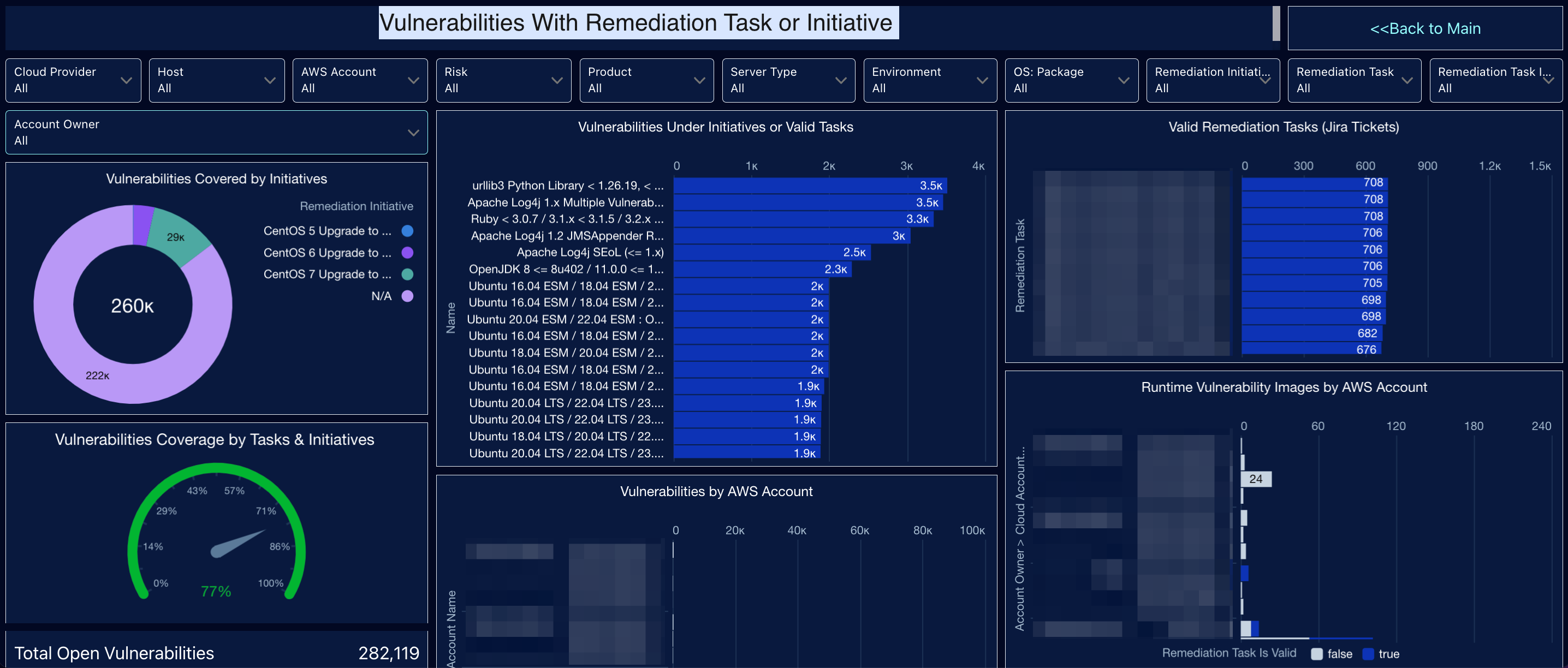
The filters let users slice data by cloud provider, host, AWS account, risk, product, server type, environment, OS/package, remediation initiative, remediation task, and task validity, so both central teams and service owners can inspect their own scope.
At the top, the dashboard shows coverage and effectiveness metrics:
- Vulnerabilities covered by Tasks and Initiatives
- Vulnerabilities with invalid Tasks or no Initiative
- MTTR or average remediation time in days
It also shows how vulnerabilities are distributed between valid and invalid remediation tasks, and highlights vulnerabilities sitting under invalid remediation tasks, which points to process breakdowns or stale assignments.
The lower section gives more operational detail:
- Vulnerabilities covered by initiatives with a donut showing how much exposure is tied to major initiatives versus uncategorized work
- A coverage gauge showing the share of open vulnerabilities that are under tasks or initiatives
- Top vulnerability groups currently under initiatives or valid tasks
- Valid remediation tasks (Jira tickets) ranked by volume
- Vulnerability distribution by AWS account
- Runtime vulnerability images by account, split by whether the linked remediation task is valid
- A historical trend of vulnerabilities closed by Jira issues over time
For users, the value is the following:
- Visibility into remediation coverage. Users can see how much of the vulnerability backlog is actually attached to a remediation task or initiative versus left unmanaged.
- Validation of remediation quality. By separating valid and invalid remediation tasks, the dashboard helps users spot weak task hygiene, broken Jira linkage, or vulnerabilities that appear assigned but are not truly under active remediation.
- Initiative-level program tracking. Users can measure whether large remediation campaigns, such as platform upgrades or package refreshes, are absorbing meaningful portions of the exposure.
- Prioritization by impact. The dashboard shows which vulnerability groups, accounts, images, and tasks represent the largest concentrations of risk, helping teams focus on the work that reduces exposure fastest.
- Operational performance monitoring. With MTTR and historical closure trends, users can evaluate whether remediation is improving over time and whether Jira-driven work is actually closing vulnerabilities.
- Gap identification and governance. The view of unassigned vulnerabilities, invalid tasks, and missing product or environment tags helps users find process gaps that prevent effective ownership and remediation tracking.
Remediation Tasks and Vulnerabilities Exceptions Dashboard
This vulnerability management dashboard combines two related workflows: remediation task management and vulnerability exception tracking.
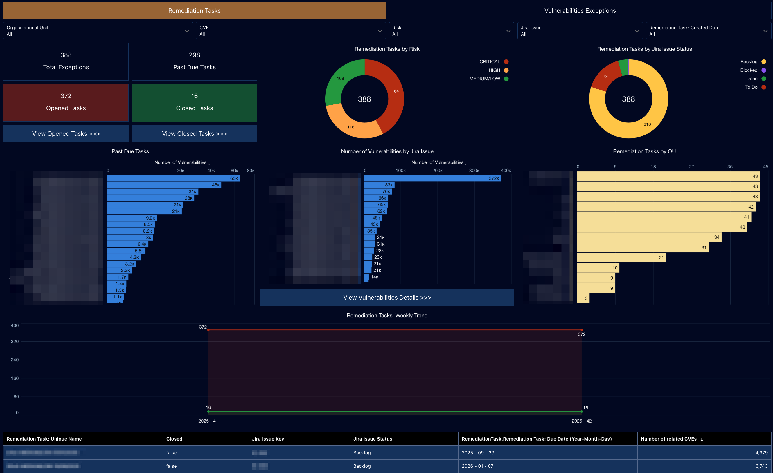
The filters at the top let users narrow the view by organizational unit, CVE, risk, Jira issue, and task created date, which makes the dashboard useful for both central security teams and local owners.
On the Remediation Tasks side, it gives users a view of the remediation backlog and execution status:
- Total remediation-related records
- Past due tasks
- Opened vs. closed tasks
- Tasks grouped by risk
- Tasks grouped by Jira status such as backlog, to do, blocked, or done
- Tasks by organizational unit
- Detailed task records with Jira key, status, due date, and number of related CVEs
It also includes ranked charts showing which remediation tasks are associated with the largest numbers of vulnerabilities, so users can see where the biggest remediation work items sit.
On the Vulnerability Exceptions side, it shows the exception inventory:
- Total exceptions
- Active vs. expired exceptions
- Count of vulnerabilities covered by each exception
- Exceptions by organizational unit
- A detailed table with exception ID, expiration date, CVE, and vulnerability counts
For users, the value is the following:
- Visibility into remediation execution. Users can see whether vulnerabilities are actually being turned into tracked remediation tasks, how large the open backlog is, and how much work is overdue.
- Workflow and ticketing oversight. By showing Jira issue status alongside remediation tasks, the dashboard helps users understand whether work is still in backlog, actively in progress, blocked, or completed.
- Prioritization of the biggest remediation items. Users can identify which tasks are tied to the highest numbers of vulnerabilities and which organizational units carry the heaviest load, so effort can be focused where it has the most impact.
- Exception governance. The dashboard provides a clear view of vulnerability exceptions, including whether they are active or expired, which is important for preventing temporary risk acceptances from becoming unmanaged long-term exposure.
- Accountability and audit readiness. Because tasks, owners, dates, statuses, and exception records are all visible in one place, the dashboard supports follow-up, management reporting, and evidence for governance or audit reviews.
- Decision support for risk treatment. By combining remediation tasks and vulnerability exceptions, the dashboard helps users distinguish between findings being fixed versus findings being formally accepted, deferred, or exempted.
See also: