Dashboard Templates & Sharing
Templates help you analyze how services are monitored and make it easy for teams to onboard new applications with minimal effort.
Use this guide to explore the dashboard templates and custom dashboards that can be used for monitoring data in Cloudaware and connected observability platforms.
Default Templates
Zabbix Dashboard (Legacy)
The Zabbix dashboard is available by default in the Zabbix application in Cloudaware Control Hub (Launcher). It provides an overview of monitoring health and alert status by host group.
The top widget Status of Zabbix displays overall system metrics, including:
- Zabbix server status
- Number of hosts
- Number of items
- Number of triggers
- Number of users currently online
- Required server performance, shown as new values per second
The System status table below summarizes active issues by monitored host group. Columns are organized by severity level:
- High
- Medium
- Low
- Warning
- Information
- Not classified
Each row represents a host group or service group. Each cell shows the number of events for the corresponding severity level.
The table uses color coding to improve readability:
- Red indicates high-severity issues
- Orange and yellow indicate medium- or low-severity issues
- Green indicates normal status or no active issues
To view additional information about an event, hover over it in the table.
Examples of events:
- No new data from ApiGateway
{instance name}.{group}.{region}.{account_id} (account_name) - Write IOPS is high on
{instance name}.{group}.{region}.{account_id} (account_name) - Too many database connections (>500 for 5m) to
{instance name}.{group}.{region}.{account_id} (account_name) - SwapUsage is too high on
{instance name}.{group}.{region}.{account_id} (account_name)
New Relic Pre-built Dashboards
For common use cases such as APM, infrastructure, and Kubernetes, you can use pre‑built dashboard templates that automatically aggregate relevant metrics, events, and logs automatically.
See also: Recommended dashboards
Custom Dashboards
In addition to default dashboard templates, users can leverage custom dashboards.
New Relic Custom Dashboards
In New Relic, you can build custom dashboards with drag‑and‑drop widgets, NRQL queries, and even external data sources (e.g., Snowflake, Google Sheets, OpenTelemetry) to create your own “unified” view tailored to your CMDB, cloud, or security monitoring needs. See also: Create custom data visualizations with dashboards
Cloudaware Analytics Dashboards
Users and teams can request custom monitoring dashboards from Cloudaware. Cloud-native metrics can be combined with cost data to showcase actual utilization and rightsizing opportunities, or with Breeze agent data to help teams/executives track the progress of New Relic adoption across the estate.
New Relic Agent Adoption and Coverage Dashboard
The dashboard shows the level of New Relic monitoring coverage across the server and instance estate, including where agents are installed, where gaps remain, how adoption is trending over time, and how consistently agent versions are deployed. It gives users both a high-level view of observability coverage and a drill-down view into which accounts, platforms, or assets still require installation or version standardization.
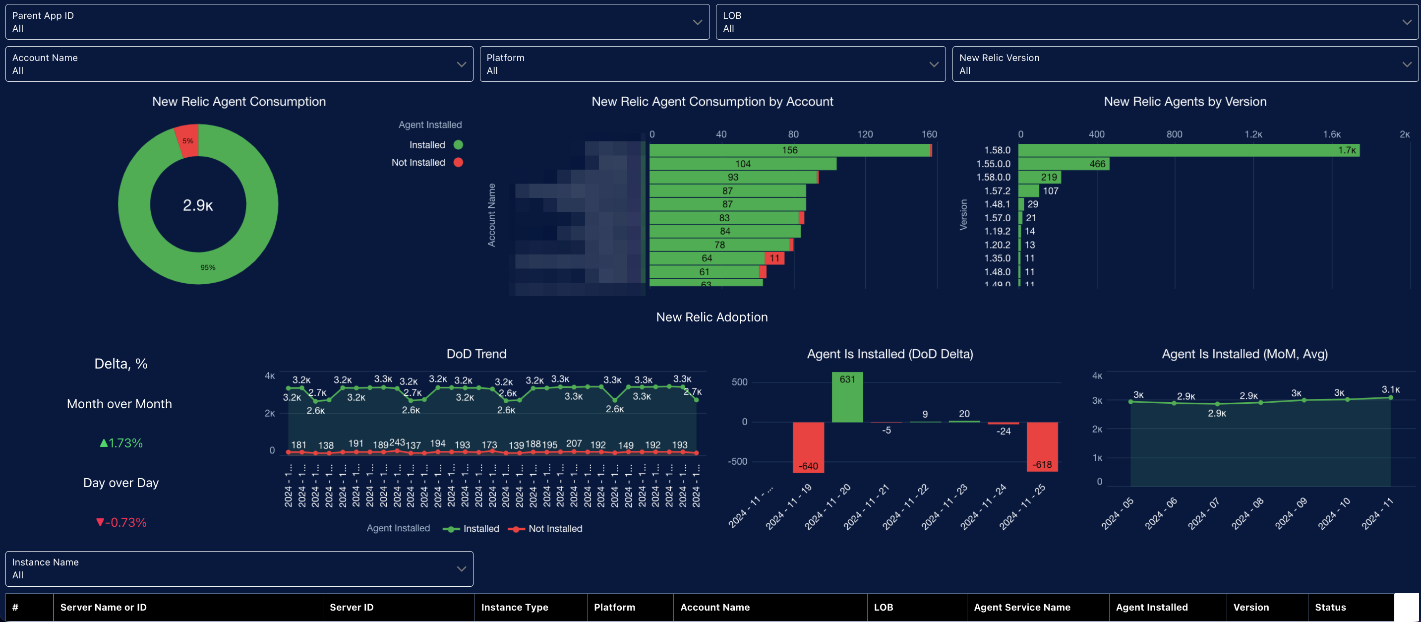
The top section is a filter bar that lets users slice the data by Parent Application ID, Line of Business (LOB), Account Name, Platform, New Relic Version, and Instance Name. That makes the dashboard usable across multiple application groups, business areas, and infrastructure segments rather than as a single enterprise-wide summary.
The main visual panels show:
- Agent Consumption Coverage: A donut chart shows how many servers or instances have the New Relic agent installed versus not installed. This is the primary coverage KPI.
- Agent Consumption by Account: A ranked horizontal bar chart shows coverage by account, making it easy to identify which accounts have the largest monitored footprint and which still have the most installation gaps.
- Agents by Version: A version distribution chart shows how many agents are running each New Relic version. This helps identify version drift and upgrade lag.
- Delta %: KPI cards show month-over-month and day-over-day change in installation coverage, highlighting whether adoption is improving or slipping.
- DoD Trend: A time-series chart shows installed versus not installed counts over time, giving users a view of short-term movement and coverage stability.
- Agent Installed DoD Delta: A daily delta chart shows net installation change by day, helping users spot rollout spikes, drops, or unusual operational changes.
- Agent Installed MoM Average: A monthly trend chart shows the longer-term adoption pattern and whether the environment is moving toward full coverage.
The bottom section is a detailed asset table for operational follow-up. It includes row-level information such as server or instance name, server ID, platform, account, LOB, agent service name, installed status, version, and overall status. This gives users the detail needed to identify exactly which assets require action.
For users, the value is in the following areas:
-
Monitoring coverage visibility.
Users can quickly see how much of the environment is instrumented and how much remains outside observability coverage.
-
Gap identification and prioritization.
By breaking coverage down by account, platform, and asset, the dashboard helps teams identify where installation gaps are concentrated and where remediation should start.
-
Version governance.
The version view shows whether teams are standardized on the approved New Relic agent version or whether older versions remain in use and need upgrade attention.
-
Adoption trend tracking.
Day-over-day and month-over-month charts show whether agent rollout is progressing, stalling, or regressing, which makes the dashboard useful for both operational tracking and program reporting.
-
Targeted investigation and action.
The filters and detailed table let users isolate specific business areas, accounts, platforms, or instances and turn a coverage issue into a concrete remediation list.
See also: Advanced Analytics
Sharing and Access Control
- Use role‑based access control (RBAC) to decide who can create, edit, or delete shared dashboards.
- Encourage teams to keep a small number of well‑maintained shared dashboards rather than many similar variants.
- Document which dashboards are “official” for incident response versus experimental or personal.